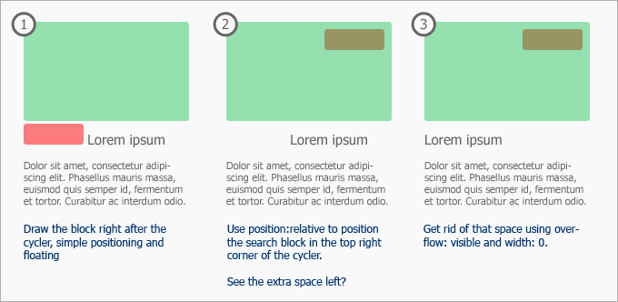
For some of you this post might be obvious, but I’ve been working with XHTML and CSS for years and haven’t figured out you could do such magic! We’ll be talking about the CSS Position property and it’s combinations with the Overflow property.
Let’s talk about each of these properties individually first. The position property could have five different values. I’m not going to explain each of them, as you can read about CSS positioning at W3Schools. We’ll be talking about one of the most useful – relative value.
I don’t see relative being used that much, instead people prefer absolute positioning, especially if we’re working on a left-aligned fixed-width layout. I agree, this is bullet-proof when your website is static. But what happens when you add that extra bit of text at the top? You drive to your stylesheet and adjust the top parameter every time something moves. Then again, absolute positioning is treated differently in some browsers, especially IE.
Relative Positioning
So why isn’t relative being used? Well there may be plenty of reasons for that, but personally I loved it when I had to overlap something, especially if it was being done vertically. Horizontal overlapping brings issues.
Perhaps the most irritating thing about relative positioning is that when you move it around, the block sort of remains in it’s own place but it’s content is moved. I’ll try to illustrate this in pictures. Let’s look at the following example:

Three fixed-width blocks, floating left, everything seems okay. Now let’s try to move the green box outside of our content block using position: relative. Here’s what happens:

We were really hoping that the red and gray blocks follow the green one, but meh!
Overflowing
This is where overflow comes in. W3Schools has got some specifications and examples on the overflow property too so I won’t be explaining the values. One interesting thing about overflow is that you can specify visible which basically means that all content that didn’t fit inside the box, is still visible outside of it.
Yes, may seem useless at first, but not in conjunction with the width: 0 property! This means that we could tell the browser that our block is 0 pixels wide, but using the overflow: visible property still display whatever is in the block!

Alright, that seems to have done it. But what is it actually for? Well let’s try to make a little list here:
- I’ve seen some javascript and CSS drop-down menus which look very sweet, but they’re using absolute positioning and counting pixels via javascript. Now that’s strange!
- You sometimes need to place a block outside of the one it is actually written in without loosing that extra space (as in the examples above).
- What if you need to place a block into another one, if in HTML it’s not supposed to be there? (example below)
Quick example – you have a big cycling picture, sort of a slide show in the middle of your page. Now that’s cycling via javascript which is replacing a block with another one, block by block. So in that slide-show you’d like to have a search box which should be on top of the cycling images.
Well, yeah, you could write 5 search boxes on each of the slides haha! Rediculous isn’t it? Draw your search right after the cycling block is closed and move it in using relative positioning:

I hope that all makes sense. Oh and by the way, did I mention I haven’t tested this in all browsers? Well works in Firefox 3 and IE 7-8.. If you’ve got some time to test this in your browser, please leave a short note in the comments section below ;)
Handling IE6
Great, I ran a few tests on different browsers, and every one worked fine except, of course, Internet Explorer 6. IE6 treats the block as a block, even if it’s width is set to 0, but there’s a fix for that too! Combining position absolute and position relative as child and parent, it seems to fix the problem. This is because absolute positioning works absolute to the browser window if there’s no positioning specified in its parent, this is why we use a relative position without any top and left options, so that the parent block stays where it is, and the child block’s absolute positioning is being counted from the parent.
This trick is helpful for relative positioning within a content block which is centered to the page for instance. So the code would be:
<div class="b">
    <div class="wrap">
        <div class="a1">
            <div class="a3">123 456 789</div>
        </div>
        <div class="a2">
        456
        </div>
    </div>
</div>
And the CSS would be:
.b {
	width: 100%;
	margin: 0;
	display: block;
}

.wrap {
	display: block;
	width: 300px;
	margin: 0 auto;
	background: yellow;
	position: relative;
	height: 100px;
}

.a1 {
	float: left;
	width: 0px;
	overflow: visible;
	position: absolute;
	left: -90px;
}

.a2 {
	float: left;
}

.a3 {
	width: 100px;
	display: block;
}
Don’t forget to specify the XHTML 1.0 Transitional Doctype!
In your first example, I find margin-left: -200px; (assuming the width of the green div to be 200px) to be simpler and more intuitive than your solution.
Good point David. Thanks!
I haven't tested this, but I think an element with <code>width:0; background:red;</code> will not have any background color at all.
Therefore, instead of setting <code>width:0;</code> it is better to use <code>margin-right:-100%;</code>.
Why go to the trouble of applying position: relative; left: -200px; margin-right: -200px; when margin-left: -200px; does it all? :D
Because IE6 and IE7 won't show the part on the left without the hasLayout fix. See http://www.brunildo.org/test/relayout.html
Thanks for the reminder, Kaspars. It's been quite a while since I tested a layout in IE7 (I scarcely ever test in IE6 these days).
Right, though you could put a block element inside and give it a background color.