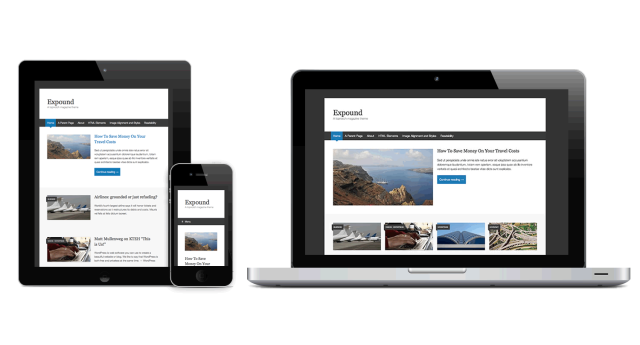
The magazine-style theme Expound has just been released for WordPress.com users. Some slight changes and updates will be pushed back to the self-hosted version in the coming weeks.

The magazine-style theme Expound has just been released for WordPress.com users. Some slight changes and updates will be pushed back to the self-hosted version in the coming weeks.
Hi,
This theme doesn’t work quite right with the Custom Design live editor.
Specifically, the colors on the menu bar have issues.
(a) the dark gray of the menu bar background is not changeable at all
(b) the third color affects both the background of the “current page” link, and a lighter version becomes the color of the menu bar links when you hover over them. This doesn’t correspond to the original design, where the “current page” link background is blue, and the links stay white when you hover over them. Once you choose to change the blue color, you have no choice but to live with colored hover-state links on the menu.
(c) the middle color doesn’t seem to do anything when I change it.
It only uses 3 of the 5 color slots, so you could make these two colors editable:
(a) menu link-hover-state color
(b) menu bar background color
Lastly, when I change the Header font size from “0” to “10” it actually gets smaller. Not sure what the relationship there is with font size, but it doesn’t work as expected.
Otherwise I really enjoy it – thank you!
Emma
Hey Emma, thanks a lot for your feedback, I’ll pass this on to the Theme Team at WordPress.com.
Hey Emma, I just got word from our Theme Team that it’s all been adjusted. Thanks again for your feedback and have a good one!
I love the look of this Expound theme, but am having a very hard time getting the posts to come up in the order in which I want them to. The article I want to appear at the top will only do so if I make it “sticky,” but I I do that, then I lose the columns. Any tips?
This is the link with the one I want at the top at the top, but the columns gone…
http://nextstepscsd.wordpress.com/
Thank you!
Hey there! You can mark more than one article sticky to put them into the featured section.
that’s nice theme you have, I use yours on mine.
but, is there any blogroll widget in this theme? I can’t add one
Hey there. You can absolutely add a blogroll widget to the theme’s sidebar, just like with any other theme in Appearance → Widgets.
I’m playing around with the Expound theme for a new site build. I like the theme. Issue: I have a header image (1020px x 154px) which displays cutoff when viewing in mobile due to the responsive layout change. How can I either disable the responsive layout change or substitute a smaller header image on the fly when the site is viewed in a smaller size (ex. on mobile phone)?
Thanks for the theme and for you help with the above.
Hi Scot. The header image is used as a header background in Expound (just like in Twenty Thirteen and many others) so instead of scaling for smaller screens – it crops to maintain the height. If you’d like to put an image in the header that doesn’t crop, your best bet would be to use Custom CSS, like we did with the logo on WP Magazine.