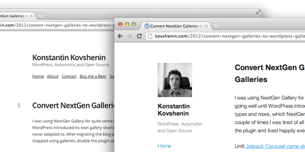
I don’t often work on designs. In fact, until today, this blog had only three different themes. The first one was a blue-ish theme from the .org repo, the second one was made by me (my worst first ever WordPress theme), and had an opening <? php tag on the top left. The third one was one I temporarily called Publish, which you see in the screenshot on the left.
Today’s “redesign” is not much different from Publish, in fact, I just called it Publish 1.1, changed fonts, colors, and moved elements around, so it’s not really a redesign, but more of a quick refresh. However, because I started contributing to Automattic’s _s starter theme, I thought I absolutely had to use it in a real-life project. And what could be more real than this? ;)
I used the theme generator to create the base for my new-old theme, used the sidebar-content demo layout and made the rest with CSS. It was a breeze and took me three hours or so. It’s far from perfect, and I’ll keep tuning it along the way. The Gravatar on the top left is a simple call to get_avatar using the admin e-mail address set in the Settings, not sure it’ll fit for multi-author blogs.
<?php echo get_avatar( get_option( 'admin_email' ), 100 ); ?>
Anyway, this is just a reminder that Underscores is so awesome! I’ll keep working on this and you can obviously follow along on Github. Feedback, bug reports and pull requests much appreciated! Have a great Wednesday :)
Update: and it’s now compatible with (some) mobile devices too. The “small-menu” script in the underscores theme is doing a really good job.
It looks great, very clean and readable. The content floats to the centre (horizontally speaking) on my phone, which makes scrolling more difficult than it should be. Other than that, it works well.
Thanks Shane! Will keep working on the “resposiveness” so that everyone can enjoy the content through their phones and tablets :) Thanks for stopping by!
Поздравляю с редизайном!
Очень стильно :)
Спасибо =)
It’s good, really nice and simple looking, no distractions. One thing I’ll miss is the small icons you had for each Post Format, I thought they were pretty cool, so it’d be nice to try and sneak them back in? :)
One or two things I have spotted, you’ll need to put your posts in a Category, or just remove the code from the Meta. The other issue is with your navigation and the Home Link not showing up when you’re on the Homepage. I don’t know if it was designed like that, but the About Link doesn’t disappear when you’re on that Page?
Hey Mark, thanks so much for your input! Yeah I loved those post format icons too, but couldn’t find an immediate way of “sticking them back in” since there’s now a sidebar on the left. I’ll think about some alternate ways :)
Regarding category, noted. I should just delete all the existing terms since I did use categories before, and _s should be smart enough to not display that ugly Uncategorized on each post.
The Home link is not displayed on the home page, err. “by design.” I thought it would be cool and got the initial idea from Jetpack’s website. Confusing, eh? Will give it a little bit more thought.
Thanks again for your feedback, really appreciated!
I’m surprised there isn’t a way to hide, by default, the Category if it’s the only one in use, for example? Sure I had a similar sort of conversation with Andrew Nacin on the subject, a while back now come to think about it. In fact, isn’t there a Trac Ticket for it?
You know, I never noticed it on Jetpack before. I think they get away with it since the navigation is horizontal. Yours being vertical, it feels like it’s jumping after every click?
There is, it’s just not working for me because I have a bunch of categories in my old posts from 2008. I only decided to stop using categories somewhere in 2011, so it’s still thinking I’ve got many, and thus, not hiding it :)
I was really referring to Core itself, considering the fact you *need* to use some kind of Category to Publish your Post, unlike Tags. But thanks for pointing out that piece of code, can’t believe I missed it before! :(
Responsive? Yes please! The small-menu.js script did a really awesome job. The rest is a couple of simple media queries :) Enjoy!
Nice redesign. Works fabulously on my iPad.
Thanks Adrienne :)